Marker
Markers are point annotations that can be placed on the map at specific geographic locations. They support custom icons, interactions, and animations.
Composable Functions
For a small number of markers, you can specify options directly. Specifying an id helps prevent unnecessary recomposition.
@Composablefun MapViewScope.Marker( position: GeoPointInterface, clickable: Boolean = true, draggable: Boolean = false, icon: MarkerIconInterface? = null, extra: Serializable? = null, id: String? = null, onClick: OnMarkerEventHandler? = null, onDragStart: OnMarkerEventHandler? = null, onDrag: OnMarkerEventHandler? = null, onDragEnd: OnMarkerEventHandler? = null, onAnimateStart: OnMarkerEventHandler? = null, onAnimateEnd: OnMarkerEventHandler? = null,)Parameters
position: Geographic coordinates (GeoPointInterface)clickable: Whether the marker responds to clicks (default:true)draggable: Whether the marker can be dragged (default:false)icon: Custom icon for the marker (MarkerIconInterface?)extra: Additional data attached to the marker (Serializable?)id: Unique identifier for the marker (String?)-onClick: Called when the marker is clickedonDragStart: Called when the marker begins draggingonDrag: Called while the marker is being draggedonDragEnd: Called when the marker’s drag endsonAnimateStart: Called whenanimate()beginsonAnimateEnd: Called whenanimate()finishes
For a large number of markers or when moving markers, using state is recommended. Specifying an id helps prevent unnecessary recomposition.
@Composablefun MapViewScope.Marker(state: MarkerState)Parameter
state: Manages the marker’s state MarkerState
Icon Types
DefaultMarkerIcon
Standard marker with customizable appearance:
ColorDefaultIcon( scale: Float = 1.0f, label: String? = null, fillColor: Color = Color.Red, strokeColor: Color = Color.Black, strokeWidth: Dp = 1.dp, labelTextColor: Color = Color.White, labelStrokeColor: Color? = null, debug: Boolean = false)DrawableDefaultMarkerIcon
Marker using a drawable resource as background:
DrawableDefaultIcon( backgroundDrawable: Drawable, scale: Float = 1.0f, strokeColor: Color? = null, strokeWidth: Dp = 1.dp)ImageIcon
Marker using a custom drawable image:
ImageIcon( drawable: Drawable, anchor: Offset = Offset(0.5f, 0.5f), debug: Boolean = false)Usage Examples
Basic Marker
// Replace MapView with your chosen map provider, such as GoogleMapView, MapboxMapViewMapView(state = mapViewState) { Marker( position = GeoPoint.fromLatLong(37.7749, -122.4194), extra = "San Francisco", id = "san-francisco-marker" )}Custom Icon Marker
// Replace MapView with your chosen map provider, such as GoogleMapView, MapboxMapViewMapView(state = mapViewState) { Marker( position = GeoPoint.fromLatLong(37.7749, -122.4194), icon = ColorDefaultIcon( scale = 1.5f, label = "SF", fillColor = Color.Blue, strokeColor = Color.White, strokeWidth = 2.dp ), extra = "San Francisco with custom icon", id = "custom-sf-marker" )}Draggable Marker
@Composablefun DraggableMarkerExample() {    var markerPosition by remember {        mutableStateOf(GeoPoint.fromLatLong(37.7749, -122.4194))    }
    // Replace MapView with your chosen map provider, such as GoogleMapView, MapboxMapView    MapView(        state = mapViewState    ) {        Marker(            position = markerPosition,            draggable = true,            icon = ColorDefaultIcon(                label = "Drag me",                fillColor = Color.Green            ),            onDrag = { markerState ->                markerPosition = markerState.position            }        )    }}
Multiple Markers with Different Icons
// Replace MapView with your chosen map provider, such as GoogleMapView, MapboxMapViewMapView(state = mapViewState) {    // Default icon with different scales    Marker(        position = GeoPoint.fromLatLong(37.7749, -122.4194),        icon = ColorDefaultIcon(scale = 0.7f, label = "Small")    )
    Marker(        position = GeoPoint.fromLatLong(37.7849, -122.4094),        icon = ColorDefaultIcon(scale = 1.0f, label = "Normal")    )
    Marker(        position = GeoPoint.fromLatLong(37.7949, -122.3994),        icon = ColorDefaultIcon(scale = 1.4f, label = "Large")    )
    // Custom colored marker    Marker(        position = GeoPoint.fromLatLong(37.7649, -122.4294),        icon = ColorDefaultIcon(            fillColor = Color.Yellow,            strokeColor = Color.Black,            strokeWidth = 2.dp,            label = "Custom"        )    )
    // Drawable icon marker    val context = LocalContext.current    AppCompatResources.getDrawable(context, R.drawable.custom_icon)?.let { drawable ->        Marker(            position = GeoPoint.fromLatLong(37.7549, -122.4394),            icon = DrawableDefaultIcon(                backgroundDrawable = drawable,                scale = 1.2f            )        )    }}
Animation
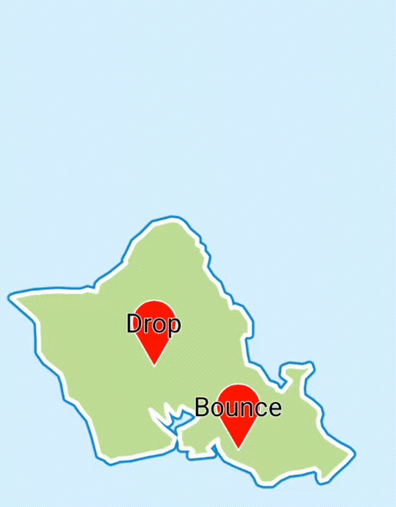
Drop- Animation where the marker moves from the top of the screen to the positionBounce- Marker moves from the top of the screen to the position, then bounces