InfoBubble
InfoBubble is a component that displays custom content in a callout-style bubble attached to a marker on the map. It provides a way to show detailed information about a marker.
Overview
InfoBubble is displayed above a specific marker. Because the content shown inside an InfoBubble can be provided as a Composable, you can implement any design you need.
Composable Functions
@Composablefun InfoBubble( marker: MarkerState, bubbleColor: Color = Color.White, borderColor: Color = Color.Black, contentPadding: Dp = 8.dp, cornerRadius: Dp = 4.dp, tailSize: Dp = 8.dp, content: @Composable () -> Unit)Parameters
marker: TheMarkerStatethat the bubble is attached tobubbleColor: The bubble background color (default: White)borderColor: The bubble border color (default: Black)contentPadding: Inner padding around the content (default: 8dp)cornerRadius: The bubble corner radius (default: 4dp)tailSize: The size of the bubble tail that points to the marker (default: 8dp)content: Composable content to display inside the bubble
Marker-Free Placement
InfoBubble can also be placed directly at any GeoPoint on the map without being tied to a MarkerState. When position changes, the bubble moves as well, and it follows map panning and zooming.
@Composablefun MapViewScope.InfoBubble( position: GeoPoint, bubbleColor: Color = Color.White, borderColor: Color = Color.Black, contentPadding: Dp = 8.dp, cornerRadius: Dp = 4.dp, tailSize: Dp = 8.dp, content: @Composable () -> Unit,)MapView(...) { InfoBubble( position = GeoPoint(35.6812, 139.7671), bubbleColor = Color.White, borderColor = Color.Blue, ) { Text("Bubble here") }}Basic Usage
Simple Text Bubble
@Composablefun SimpleInfoBubbleExample() {    val center = GeoPoint.fromLatLong(52.5163, 13.3777)
    val camera = MapCameraPosition(position = center, zoom = 13)    val mapViewState = rememberHereMapViewState(cameraPosition = camera)
    var selectedMarker by remember { mutableStateOf<MarkerState?>(null) }    val onMarkerClick: OnMarkerEventHandler = { markerState ->        selectedMarker = markerState    }
    HereMapView(        modifier = modifier,        state = mapViewState,        onMapClick = { selectedMarker = null }    ) {        val markerState = MarkerState(            position = center,            icon = ColorDefaultIcon(fillColor = Color.Green, label = "POI"),            extra = "Brandenburg Gate",            id = "poi-marker",            onClick = onMarkerClick        )
        Marker(markerState)
        selectedMarker?.let { marker ->            InfoBubble(                marker = marker,                contentPadding = 12.dp,                cornerRadius = 8.dp,                tailSize = 10.dp            ) {                Text(                    text = marker.extra as? String ?: "",                    color = Color.Black,                    style = MaterialTheme.typography.bodyLarge                )            }        }    }}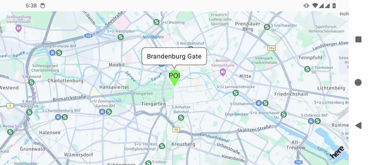
Custom Styled Bubble
data class LocationInfo(    val name: String,    val description: String,    val rating: Float,    val imageUrl: String? = null) : java.io.Serializable
@Composablefun RichContentBubbleExample() {    var selectedMarker by remember { mutableStateOf<MarkerState?>(null) }
    val center = GeoPoint.fromLatLong(37.7694, -122.4862)    val camera = MapCameraPosition(position = center, zoom = 13)    val mapViewState = rememberHereMapViewState(cameraPosition = camera)    val onMarkerClick: OnMarkerEventHandler = { markerState ->        selectedMarker = markerState    }
    HereMapView(        modifier = modifier,        state = mapViewState,        onMapClick = { selectedMarker = null }    ) {        val locationInfo = LocationInfo(            name = "Golden Gate Park",            description = "A large urban park with gardens, museums, and recreational areas.",            rating = 4.5f        )
        val markerState = MarkerState(            position = GeoPoint.fromLatLong(37.7694, -122.4862),            icon = ColorDefaultIcon(fillColor = Color.Green, label = "🌳"),            extra = locationInfo,            id = "park-marker",            onClick = onMarkerClick        )
        Marker(markerState)
        selectedMarker?.let { marker ->            val info = marker.extra as? LocationInfo            info?.let {                InfoBubble(                    marker = marker,                    bubbleColor = MaterialTheme.colorScheme.background,                    borderColor = Color.Gray,                    contentPadding = 16.dp,                    cornerRadius = 12.dp                ) {                    Column(modifier = Modifier.width(200.dp)) {                        Text(                            text = info.name,                            style = MaterialTheme.typography.headlineSmall,                            color = MaterialTheme.colorScheme.primary,                            fontWeight = FontWeight.Bold                        )                        Spacer(modifier = Modifier.height(8.dp))                        Text(                            text = info.description,                            style = MaterialTheme.typography.bodyMedium,                            color = MaterialTheme.colorScheme.primary                        )                        Spacer(modifier = Modifier.height(8.dp))                        Row(verticalAlignment = Alignment.CenterVertically) {                            repeat(5) { index ->                                Icon(                                    Icons.Default.Star,                                    contentDescription = null,                                    tint = if (index < info.rating.toInt()) Color.Yellow else Color.Gray,                                    modifier = Modifier.size(16.dp)                                )                            }                            Text(                                text = " ${info.rating}/5",                                color = MaterialTheme.colorScheme.primary,                                style = MaterialTheme.typography.bodySmall,                                modifier = Modifier.padding(start = 4.dp)                            )                        }                    }                }            }        }    }}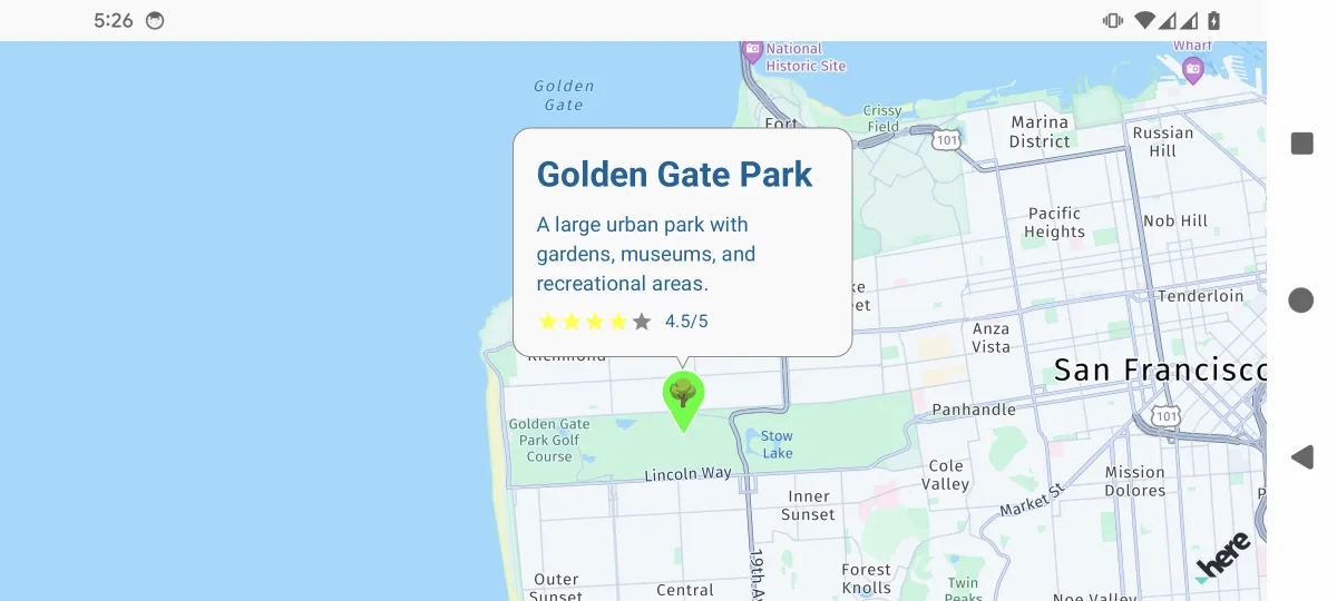
Interactive Bubble with Actions
data class StoreInfo(    val name: String,    val address: String,    val phone: String,    val type: String) : java.io.Serializable
@Composablefun InteractiveBubbleExample(modifier: Modifier = Modifier) {    val center = GeoPoint.fromLatLong(35.70662, 139.76378)    val camera = MapCameraPosition(position = center, zoom = 16)    val mapViewState = rememberArcGISMapViewState(cameraPosition = camera)
    var selectedMarker by remember { mutableStateOf<MarkerState?>(null) }    val context = LocalContext.current    val onMarkerClick: OnMarkerEventHandler = { markerState ->        selectedMarker = markerState    }
    ArcGISMapView(        state = mapViewState,        modifier = modifier,        onMapClick = { selectedMarker = null }    ) {        val storeInfo = StoreInfo(            name = "Coffee Shop",            address = "1-4, Hongo 4-Chome, Bunkyo-Ku",            phone = "+81 (555) 123-4567",            type = "coffee"        )
        val markerState = MarkerState(            position = GeoPoint.fromLatLong(35.708106, 139.760823),            icon = ColorDefaultIcon(fillColor = Color(0xFF8B4513), label = "☕"),            extra = storeInfo,            id = "coffee-shop-marker",            onClick = onMarkerClick        )
        Marker(markerState)
        selectedMarker?.let { marker ->            val store = marker.extra as? StoreInfo            store?.let {                InfoBubble(                    marker = marker,                    bubbleColor = Color.White,                    borderColor = Color.Black,                    contentPadding = 12.dp,                    cornerRadius = 8.dp                ) {                    Column(modifier = Modifier.width(250.dp)) {                        Text(                            text = store.name,                            style = MaterialTheme.typography.titleMedium,                            fontWeight = FontWeight.Bold                        )                        Text(                            text = store.address,                            style = MaterialTheme.typography.bodySmall,                            color = Color.Gray,                            modifier = Modifier.padding(vertical = 4.dp)                        )                        Row(                            modifier = Modifier.fillMaxWidth(),                            horizontalArrangement = Arrangement.SpaceEvenly                        ) {                            Button(                                onClick = {                                    val intent = Intent(Intent.ACTION_DIAL).apply {                                        data = Uri.parse("tel:${store.phone}")                                    }                                    context.startActivity(intent)                                },                                colors = ButtonDefaults.buttonColors(containerColor = Color.Blue)                            ) {                                Icon(Icons.Default.Phone, contentDescription = "Call")                                Text("Call", modifier = Modifier.padding(start = 4.dp))                            }                        }                    }                }            }        }    }}
Managing Multiple Bubbles
@Composablefun MultipleBubblesExample() {    val mapViewState = rememberGoogleMapViewState()    var selectedMarkers by remember { mutableStateOf(setOf<String>()) }    val onMarkerClick: OnMarkerEventHandler = { markerState ->        selectedMarkers = if (selectedMarkers.contains(markerState.id)) {            selectedMarkers - markerState.id // Deselect        } else {            selectedMarkers + markerState.id // Select        }    }
    val markerData = remember {        listOf(            Triple(                GeoPoint.fromLatLong(37.7749, -122.4194),                "Restaurant A",                Color.Red            ),            Triple(                GeoPoint.fromLatLong(37.7849, -122.4094),                "Hotel B",                Color.Blue            ),            Triple(                GeoPoint.fromLatLong(37.7649, -122.4294),                "Shop C",                Color.Green            )        )    }
    val markerStates = remember {        markerData.mapIndexed { index, (position, name, color) ->            MarkerState(                id = "marker_$index",                position = position,                icon = ColorDefaultIcon(fillColor = color, label = "${index + 1}"),                extra = name,                onClick = onMarkerClick            )        }    }
    // Replace MapView with a map SDK such as GoogleMapView or MapboxMapView    MapView(        state = mapViewState,        onMapClick = {            selectedMarkers = emptySet() // Clear all selections        }    ) {        markerStates.forEach { markerState ->            Marker(markerState)
            // Show bubble if marker is selected            if (selectedMarkers.contains(markerState.id)) {                InfoBubble(                    marker = markerState,                    bubbleColor = Color.White,                    borderColor = Color.Black                ) {                    Column {                        Text(                            text = markerState.extra as String,                            style = MaterialTheme.typography.bodyMedium,                            fontWeight = FontWeight.Bold                        )                        Text(                            text = "Tap to close",                            style = MaterialTheme.typography.bodySmall,                            color = Color.Gray                        )                    }                }            }        }    }}
Custom Design
To implement a custom design, you can create your own InfoBubble-derived component. The following is a detailed implementation example of a custom bubble with a tail on the right side.
@Composablefun RightInfoBubbleMapExample(modifier: Modifier = Modifier) {    val center = GeoPoint.fromLatLong(37.7749, -122.4194)    val mapViewState =        rememberMapLibreMapViewState(            cameraPosition =                MapCameraPosition(                    position = center,                    zoom = 13,                ),        )    var selectedMarker by remember { mutableStateOf<MarkerState?>(null) }    val onMarkerClick: OnMarkerEventHandler = { markerState ->        selectedMarker = markerState    }    val onMarkerDragStart: OnMarkerEventHandler = { markerState ->        println("Started dragging marker: ${markerState.id}")    }    val onMarkerDrag: OnMarkerEventHandler = { markerState ->        println("Dragging marker: ${markerState.position}")    }    val onMarkerDragEnd: OnMarkerEventHandler = { markerState ->        println("Finished dragging marker: ${markerState.id}")    }
    val markerState1 by remember {        mutableStateOf(            MarkerState(                id = "marker1",                position = GeoPoint.fromLatLong(37.7749, -122.4194),                icon =                    ColorDefaultIcon(                        fillColor = Color.Blue,                        infoAnchor = Offset(0.5f, 0.25f),                        label = "1",                    ),                draggable = true,                onClick = onMarkerClick,                onDragStart = onMarkerDragStart,                onDrag = onMarkerDrag,                onDragEnd = onMarkerDragEnd,            ),        )    }    val markerState2 by remember {        mutableStateOf(            MarkerState(                id = "marker2",                position = GeoPoint.fromLatLong(37.7849, -122.4094),                icon =                    ColorDefaultIcon(                        fillColor = Color.Red,                        infoAnchor = Offset(0.5f, 0.25f),                        label = "2",                    ),                onClick = onMarkerClick,            ),        )    }
    MapLibreMapView(        state = mapViewState,        onMapLoaded = {            println("Map has finished loading")        },        onMapClick = { geoPoint ->            selectedMarker = null // Click the map to clear selection        }    ) {        // Map content with interactive markers        Marker(markerState1)        Marker(markerState2)
        // Show information for the selected marker        selectedMarker?.let { marker ->            val text = GeoPoint.from(marker.position).toUrlValue(6)            // Example of a custom bubble with a right-side tail            InfoBubbleCustom(                marker = marker,                tailOffset = Offset(0f, 0.5f), // attach at center-left of the bubble            ) {                RightTailInfoBubble(                    bubbleColor = Color.White,                    borderColor = Color.Black,                ) {                    Text(                        text = text,                        color = MaterialTheme.colorScheme.primary,                    )                }            }        }    }}
@Composableprivate fun RightTailInfoBubble(    bubbleColor: Color,    borderColor: Color,    contentPadding: androidx.compose.ui.unit.Dp = 8.dp,    cornerRadius: androidx.compose.ui.unit.Dp = 4.dp,    tailSize: androidx.compose.ui.unit.Dp = 8.dp,    content: @Composable () -> Unit,) {    Box(modifier = Modifier.wrapContentSize()) {        Canvas(modifier = Modifier.matchParentSize()) {            val width = size.width            val height = size.height            val tail = tailSize.toPx()            val corner = cornerRadius.toPx()
            val path =                Path().apply {                    // start at top-left (after tail area)                    moveTo(tail + 2 * corner, 0f)                    lineTo(width - 2 * corner, 0f)                    // top-right corner                    arcTo(                        rect =                            Rect(                                topLeft = Offset(width - 2 * corner, 0f),                                bottomRight = Offset(width, 2 * corner),                            ),                        startAngleDegrees = -90f,                        sweepAngleDegrees = 90f,                        forceMoveTo = false,                    )                    // right edge                    lineTo(width, height - 2 * corner)                    // bottom-right corner                    arcTo(                        rect =                            Rect(                                topLeft = Offset(width - 2 * corner, height - 2 * corner),                                bottomRight = Offset(width, height),                            ),                        startAngleDegrees = 0f,                        sweepAngleDegrees = 90f,                        forceMoveTo = false,                    )                    // bottom edge towards left (before tail)                    lineTo(tail + 2 * corner, height)                    // bottom-left corner (before tail)                    arcTo(                        rect =                            Rect(                                topLeft = Offset(tail, height - 2 * corner),                                bottomRight = Offset(tail + 2 * corner, height),                            ),                        startAngleDegrees = 90f,                        sweepAngleDegrees = 90f,                        forceMoveTo = false,                    )                    // left edge up to tail bottom                    lineTo(tail, height / 2 + tail / 2)                    // Tail on left side                    lineTo(0f, height / 2)                    lineTo(tail, height / 2 - tail / 2)                    // left edge up to top-left corner                    lineTo(tail, 2 * corner)                    // top-left corner                    arcTo(                        rect =                            Rect(                                topLeft = Offset(tail, 0f),                                bottomRight = Offset(tail + 2 * corner, 2 * corner),                            ),                        startAngleDegrees = 180f,                        sweepAngleDegrees = 90f,                        forceMoveTo = false,                    )                    close()                }
            drawPath(path, color = bubbleColor, style = Fill)            drawPath(path, color = borderColor, style = Stroke(width = 2f))        }
        Box(            modifier =                Modifier                    .padding(                        start = contentPadding + tailSize,                        top = contentPadding,                        bottom = contentPadding,                        end = contentPadding,                    ).wrapContentSize()                    .clip(RoundedCornerShape(cornerRadius)),        ) {            content()        }    }}
Placement and Behavior
Automatic Placement
InfoBubble is automatically positioned above the associated marker:
- The bubble tail points to the center of the marker
- The bubble adjusts its position to stay visible within the map viewport
- When the map is panned or zoomed, the bubble follows the marker
Custom Placement
InfoBubble handles placement automatically, but you can influence it through the marker icon anchor:
// Marker with bottom-center anchor - bubble will appear aboveval markerWithBottomAnchor = MarkerState(    position = position,    icon = ImageColorDefaultIcon(        drawable = customIcon,        anchor = Offset(0.5f, 1f) // Bottom center    ))
// Marker with center anchor - bubble will appear above centerval markerWithCenterAnchor = MarkerState(    position = position,    icon = ImageColorDefaultIcon(        drawable = customIcon,        anchor = Offset(0.5f, 0.5f) // Center    ))
Lifecycle Management
InfoBubble automatically manages its lifecycle:
// Bubble appears when component is composedselectedMarker?.let { marker ->    InfoBubble(marker = marker) {        // Content    }}
// Bubble disappears when component is removed from composition// This automatically happens when selectedMarker becomes null
Manual Lifecycle Control
@Composablefun ManualLifecycleExample() {    var showBubble by remember { mutableStateOf(false) }    val markerState = remember { /* marker state */ }
    LaunchedEffect(showBubble) {        if (showBubble) {            delay(3000) // Show for 3 seconds            showBubble = false        }    }
    // Replace MapView with your chosen map provider, such as GoogleMapView, MapboxMapView    MapView(state = mapViewState) {        Marker(markerState)
        if (showBubble) {            InfoBubble(marker = markerState) {                Text("Auto-hiding bubble")            }        }    }}
Styles and Themes
Dark Mode Support
@Composablefun DarkModeInfoBubble(marker: MarkerState) {    val isDarkTheme = isSystemInDarkTheme()
    InfoBubble(        marker = marker,        bubbleColor = if (isDarkTheme) Color(0xFF2D2D2D) else Color.White,        borderColor = if (isDarkTheme) Color(0xFF555555) else Color.Black,        contentPadding = 12.dp,        cornerRadius = 8.dp    ) {        Text(            text = marker.extra as? String ?: "",            color = if (isDarkTheme) Color.White else Color.Black,            style = MaterialTheme.typography.bodyMedium        )    }}
Custom Theme
data class BubbleTheme(    val backgroundColor: Color,    val borderColor: Color,    val textColor: Color,    val contentPadding: Dp,    val cornerRadius: Dp,    val tailSize: Dp) : java.io.Serializable
val DefaultBubbleTheme = BubbleTheme(    backgroundColor = Color.White,    borderColor = Color.Black,    textColor = Color.Black,    contentPadding = 8.dp,    cornerRadius = 4.dp,    tailSize = 8.dp)
val DarkBubbleTheme = BubbleTheme(    backgroundColor = Color(0xFF2D2D2D),    borderColor = Color(0xFF555555),    textColor = Color.White,    contentPadding = 12.dp,    cornerRadius = 8.dp,    tailSize = 10.dp)
@Composablefun ThemedInfoBubble(    marker: MarkerState,    theme: BubbleTheme = DefaultBubbleTheme,    content: @Composable () -> Unit) {    InfoBubble(        marker = marker,        bubbleColor = theme.backgroundColor,        borderColor = theme.borderColor,        contentPadding = theme.contentPadding,        cornerRadius = theme.cornerRadius,        tailSize = theme.tailSize,        content = content    )}
Performance Considerations
Efficient Updates
// Good: Use stable keys for markersval markerStates = remember(markersData) {    markersData.map { data ->        MarkerState(            id = "marker_${data.id}", // Stable ID            position = data.position,            extra = data        )    }}
// Avoid: Creating new marker state on every recompositionval markerStates = markersData.map { data ->    MarkerState(position = data.position, extra = data) // New instance each time}
Memory Management
// Clear selected marker when navigating awayDisposableEffect(Unit) { onDispose { selectedMarker = null // Clear the InfoBubble }}InfoBubbleCustom
With InfoBubbleCustom, you can freely draw the entire bubble, including its tail, as a Composable. tailOffset specifies which point inside the bubble is used as the connection point to the marker with Offset(0f..1f, 0f..1f).
Offset(1f, 0.5f): Use the right center as the connection pointOffset(0.5f, 1f): Use the bottom center as the connection point
@Composablefun MapViewScope.InfoBubbleCustom( marker: MarkerState, tailOffset: Offset, content: @Composable () -> Unit,)InfoBubbleCustom( marker = markerState, // Marker tailOffset = Offset(1f, 0.5f), // Use the right center as the connection point) { // カスタム形状の吹き出しを描画 Box( modifier = Modifier .background(Color.Yellow, RoundedCornerShape(8.dp)) .padding(8.dp) ) { Text("カスタムバブル") }}Best Practices
Design Guidelines
- Concise content: InfoBubble should provide essential information without overwhelming the user
- Appropriate size: Limit the bubble width to maintain readability on mobile devices
- Clear actions: If you include buttons, make their purpose clear
- Touch targets: Make sure interactive elements meet the minimum touch target size
User Experience
- Dismissal behavior: Let users close the bubble by tapping the map or a marker
- Loading states: Show a loading indicator for content that requires network requests
- Error handling: Handle missing or invalid data appropriately
- Accessibility: Provide content descriptions for screen readers
Implementation Tips
// Good: Stable marker referenceval markerState = remember(markerId) {    MarkerState(id = markerId, position = position)}
// Good: Efficient content updatesLaunchedEffect(selectedMarkerId) {    if (selectedMarkerId != null) {        // Load additional data if needed    }}
// Avoid: Heavy computation inside bubble contentInfoBubble(marker = marker) {    // Avoid expensive operations here    val processedData = remember(marker.extra) {        processData(marker.extra) // Move to remember    }    DisplayContent(processedData)}
Troubleshooting
Common Issues
- Bubble does not appear: Make sure the marker is configured correctly and the InfoBubble is inside the MapViewScope
- Bubble does not close: Check that conditional rendering responds correctly to state changes
- Poor performance: Limit the number of bubbles displayed at the same time and optimize content composition
- Layout issues: Use appropriate size constraints and test with different screen sizes