InfoBubble
InfoBubble は、地図上のマーカーに吹き出し形式でカスタムコンテンツを表示するコンポーネントです。マーカーに関する詳細情報を表示する方法を提供します。
InfoBubble は、特定のマーカーの上に表示されます。InfoBubble内に表示するコンテンツはComposableを与えることができるので、自由なデザインを実現できます。
Composable 関数
Section titled “Composable 関数”@Composablefun InfoBubble( marker: MarkerState, bubbleColor: Color = Color.White, borderColor: Color = Color.Black, contentPadding: Dp = 8.dp, cornerRadius: Dp = 4.dp, tailSize: Dp = 8.dp, content: @Composable () -> Unit)marker: バブルが付加されるMarkerStatebubbleColor: バブルの背景色(デフォルト: White)borderColor: バブルの境界線の色(デフォルト: Black)contentPadding: コンテンツ周りの内部パディング(デフォルト: 8dp)cornerRadius: バブルの角丸の半径(デフォルト: 4dp)tailSize: マーカーを指す吹き出しの尾のサイズ(デフォルト: 8dp)content: バブル内に表示する Composable コンテンツ
基本的な使用方法
Section titled “基本的な使用方法”シンプルなテキストバブル
Section titled “シンプルなテキストバブル”@Composablefun SimpleInfoBubbleExample() { val center = GeoPoint.fromLatLong(52.5163, 13.3777)
val camera = MapCameraPosition(position = center, zoom = 13) val mapViewState = rememberHereMapViewState(cameraPosition = camera)
var selectedMarker by remember { mutableStateOf<MarkerState?>(null) } val onMarkerClick: OnMarkerEventHandler = { markerState -> selectedMarker = markerState }
HereMapView( modifier = modifier, state = mapViewState, onMapClick = { selectedMarker = null } ) { val markerState = MarkerState( position = center, icon = DefaultIcon(fillColor = Color.Green, label = "POI"), extra = "Brandenburg Gate", id = "poi-marker", onClick = onMarkerClick )
Marker(markerState)
selectedMarker?.let { marker -> InfoBubble( marker = marker, contentPadding = 12.dp, cornerRadius = 8.dp, tailSize = 10.dp ) { Text( text = marker.extra as? String ?: "", color = Color.Black, style = MaterialTheme.typography.bodyLarge ) } } }}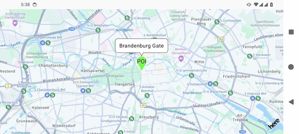
カスタムスタイルのバブル
Section titled “カスタムスタイルのバブル”data class LocationInfo( val name: String, val description: String, val rating: Float, val imageUrl: String? = null) : java.io.Serializable
@Composablefun RichContentBubbleExample() { var selectedMarker by remember { mutableStateOf<MarkerState?>(null) }
val center = GeoPoint.fromLatLong(37.7694, -122.4862) val camera = MapCameraPosition(position = center, zoom = 13) val mapViewState = rememberHereMapViewState(cameraPosition = camera) val onMarkerClick: OnMarkerEventHandler = { markerState -> selectedMarker = markerState }
HereMapView( modifier = modifier, state = mapViewState, onMapClick = { selectedMarker = null } ) { val locationInfo = LocationInfo( name = "Golden Gate Park", description = "A large urban park with gardens, museums, and recreational areas.", rating = 4.5f )
val markerState = MarkerState( position = GeoPoint.fromLatLong(37.7694, -122.4862), icon = DefaultIcon(fillColor = Color.Green, label = "🌳"), extra = locationInfo, id = "park-marker", onClick = onMarkerClick )
Marker(markerState)
selectedMarker?.let { marker -> val info = marker.extra as? LocationInfo info?.let { InfoBubble( marker = marker, bubbleColor = MaterialTheme.colorScheme.background, borderColor = Color.Gray, contentPadding = 16.dp, cornerRadius = 12.dp ) { Column(modifier = Modifier.width(200.dp)) { Text( text = info.name, style = MaterialTheme.typography.headlineSmall, color = MaterialTheme.colorScheme.primary, fontWeight = FontWeight.Bold ) Spacer(modifier = Modifier.height(8.dp)) Text( text = info.description, style = MaterialTheme.typography.bodyMedium, color = MaterialTheme.colorScheme.primary ) Spacer(modifier = Modifier.height(8.dp)) Row(verticalAlignment = Alignment.CenterVertically) { repeat(5) { index -> Icon( Icons.Default.Star, contentDescription = null, tint = if (index < info.rating.toInt()) Color.Yellow else Color.Gray, modifier = Modifier.size(16.dp) ) } Text( text = " ${info.rating}/5", color = MaterialTheme.colorScheme.primary, style = MaterialTheme.typography.bodySmall, modifier = Modifier.padding(start = 4.dp) ) } } } } } }}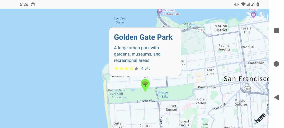
アクション付きのインタラクティブバブル
Section titled “アクション付きのインタラクティブバブル”data class StoreInfo( val name: String, val address: String, val phone: String, val type: String) : java.io.Serializable
@Composablefun InteractiveBubbleExample(modifier: Modifier = Modifier) { val center = GeoPoint.fromLatLong(35.70662, 139.76378) val camera = MapCameraPosition(position = center, zoom = 16) val mapViewState = rememberArcGISMapViewState(cameraPosition = camera)
var selectedMarker by remember { mutableStateOf<MarkerState?>(null) } val context = LocalContext.current val onMarkerClick: OnMarkerEventHandler = { markerState -> selectedMarker = markerState }
ArcGISMapView( state = mapViewState, modifier = modifier, onMapClick = { selectedMarker = null } ) { val storeInfo = StoreInfo( name = "Coffee Shop", address = "1-4, Hongo 4-Chome, Bunkyo-Ku", phone = "+81 (555) 123-4567", type = "coffee" )
val markerState = MarkerState( position = GeoPoint.fromLatLong(35.708106, 139.760823), icon = DefaultIcon(fillColor = Color(0xFF8B4513), label = "☕"), extra = storeInfo, id = "coffee-shop-marker", onClick = onMarkerClick )
Marker(markerState)
selectedMarker?.let { marker -> val store = marker.extra as? StoreInfo store?.let { InfoBubble( marker = marker, bubbleColor = Color.White, borderColor = Color.Black, contentPadding = 12.dp, cornerRadius = 8.dp ) { Column(modifier = Modifier.width(250.dp)) { Text( text = store.name, style = MaterialTheme.typography.titleMedium, fontWeight = FontWeight.Bold ) Text( text = store.address, style = MaterialTheme.typography.bodySmall, color = Color.Gray, modifier = Modifier.padding(vertical = 4.dp) ) Row( modifier = Modifier.fillMaxWidth(), horizontalArrangement = Arrangement.SpaceEvenly ) { Button( onClick = { val intent = Intent(Intent.ACTION_DIAL).apply { data = Uri.parse("tel:${store.phone}") } context.startActivity(intent) }, colors = ButtonDefaults.buttonColors(containerColor = Color.Blue) ) { Icon(Icons.Default.Phone, contentDescription = "Call") Text("Call", modifier = Modifier.padding(start = 4.dp)) } } } } } } }}複数のバブル管理
Section titled “複数のバブル管理”@Composablefun MultipleBubblesExample() { val mapViewState = rememberGoogleMapViewState() var selectedMarkers by remember { mutableStateOf(setOf<String>()) } val onMarkerClick: OnMarkerEventHandler = { markerState -> selectedMarkers = if (selectedMarkers.contains(markerState.id)) { selectedMarkers - markerState.id // Deselect } else { selectedMarkers + markerState.id // Select } }
val markerData = remember { listOf( Triple( GeoPoint.fromLatLong(37.7749, -122.4194), "Restaurant A", Color.Red ), Triple( GeoPoint.fromLatLong(37.7849, -122.4094), "Hotel B", Color.Blue ), Triple( GeoPoint.fromLatLong(37.7649, -122.4294), "Shop C", Color.Green ) ) }
val markerStates = remember { markerData.mapIndexed { index, (position, name, color) -> MarkerState( id = "marker_$index", position = position, icon = DefaultIcon(fillColor = color, label = "${index + 1}"), extra = name, onClick = onMarkerClick ) } }
// MapView を GoogleMapView、MapboxMapView などのマップ地図SDKに置き換えてください MapView( state = mapViewState, onMapClick = { selectedMarkers = emptySet() // Clear all selections } ) { markerStates.forEach { markerState -> Marker(markerState)
// Show bubble if marker is selected if (selectedMarkers.contains(markerState.id)) { InfoBubble( marker = markerState, bubbleColor = Color.White, borderColor = Color.Black ) { Column { Text( text = markerState.extra as String, style = MaterialTheme.typography.bodyMedium, fontWeight = FontWeight.Bold ) Text( text = "タップして閉じる", style = MaterialTheme.typography.bodySmall, color = Color.Gray ) } } } } }}カスタムデザイン
Section titled “カスタムデザイン”カスタムデザインを実装するには、独自の InfoBubble 派生コンポーネントを作成できます。以下は、右側に尾を持つカスタム吹き出しの詳細な実装例です。
@Composablefun RightInfoBubbleMapExample(modifier: Modifier = Modifier) {    val center = GeoPoint.fromLatLong(37.7749, -122.4194)    val mapViewState =        rememberMapLibreMapViewState(            cameraPosition =                MapCameraPosition(                    position = center,                    zoom = 13,                ),        )    var selectedMarker by remember { mutableStateOf<MarkerState?>(null) }    val onMarkerClick: OnMarkerEventHandler = { markerState ->        selectedMarker = markerState    }    val onMarkerDragStart: OnMarkerEventHandler = { markerState ->        println("マーカーのドラッグを開始: ${markerState.id}")    }    val onMarkerDrag: OnMarkerEventHandler = { markerState ->        println("マーカーをドラッグ中: ${markerState.position}")    }    val onMarkerDragEnd: OnMarkerEventHandler = { markerState ->        println("マーカーのドラッグが終了: ${markerState.id}")    }
    val markerState1 by remember {        mutableStateOf(            MarkerState(                id = "marker1",                position = GeoPoint.fromLatLong(37.7749, -122.4194),                icon =                    DefaultIcon(                        fillColor = Color.Blue,                        infoAnchor = Offset(0.5f, 0.25f),                        label = "1",                    ),                draggable = true,                onClick = onMarkerClick,                onDragStart = onMarkerDragStart,                onDrag = onMarkerDrag,                onDragEnd = onMarkerDragEnd,            ),        )    }    val markerState2 by remember {        mutableStateOf(            MarkerState(                id = "marker2",                position = GeoPoint.fromLatLong(37.7849, -122.4094),                icon =                    DefaultIcon(                        fillColor = Color.Red,                        infoAnchor = Offset(0.5f, 0.25f),                        label = "2",                    ),                onClick = onMarkerClick,            ),        )    }
    MapLibreMapView(        state = mapViewState,        onMapLoaded = {            println("地図の読み込みが完了しました")        },        onMapClick = { geoPoint ->            selectedMarker = null // 地図クリックで選択解除        }    ) {        // インタラクティブなマーカーを持つ地図コンテンツ        Marker(markerState1)        Marker(markerState2)
        // 選択されたマーカーの情報を表示        selectedMarker?.let { marker ->            val text = GeoPoint.from(marker.position).toUrlValue(6)            // 右側に尾を持つカスタム吹き出しの例            InfoBubbleCustom(                marker = marker,                tailOffset = Offset(0f, 0.5f), // attach at center-left of the bubble            ) {                RightTailInfoBubble(                    bubbleColor = Color.White,                    borderColor = Color.Black,                ) {                    Text(                        text = text,                        color = MaterialTheme.colorScheme.primary,                    )                }            }        }    }}
@Composableprivate fun RightTailInfoBubble(    bubbleColor: Color,    borderColor: Color,    contentPadding: androidx.compose.ui.unit.Dp = 8.dp,    cornerRadius: androidx.compose.ui.unit.Dp = 4.dp,    tailSize: androidx.compose.ui.unit.Dp = 8.dp,    content: @Composable () -> Unit,) {    Box(modifier = Modifier.wrapContentSize()) {        Canvas(modifier = Modifier.matchParentSize()) {            val width = size.width            val height = size.height            val tail = tailSize.toPx()            val corner = cornerRadius.toPx()
            val path =                Path().apply {                    // start at top-left (after tail area)                    moveTo(tail + 2 * corner, 0f)                    lineTo(width - 2 * corner, 0f)                    // top-right corner                    arcTo(                        rect =                            Rect(                                topLeft = Offset(width - 2 * corner, 0f),                                bottomRight = Offset(width, 2 * corner),                            ),                        startAngleDegrees = -90f,                        sweepAngleDegrees = 90f,                        forceMoveTo = false,                    )                    // right edge                    lineTo(width, height - 2 * corner)                    // bottom-right corner                    arcTo(                        rect =                            Rect(                                topLeft = Offset(width - 2 * corner, height - 2 * corner),                                bottomRight = Offset(width, height),                            ),                        startAngleDegrees = 0f,                        sweepAngleDegrees = 90f,                        forceMoveTo = false,                    )                    // bottom edge towards left (before tail)                    lineTo(tail + 2 * corner, height)                    // bottom-left corner (before tail)                    arcTo(                        rect =                            Rect(                                topLeft = Offset(tail, height - 2 * corner),                                bottomRight = Offset(tail + 2 * corner, height),                            ),                        startAngleDegrees = 90f,                        sweepAngleDegrees = 90f,                        forceMoveTo = false,                    )                    // left edge up to tail bottom                    lineTo(tail, height / 2 + tail / 2)                    // Tail on left side                    lineTo(0f, height / 2)                    lineTo(tail, height / 2 - tail / 2)                    // left edge up to top-left corner                    lineTo(tail, 2 * corner)                    // top-left corner                    arcTo(                        rect =                            Rect(                                topLeft = Offset(tail, 0f),                                bottomRight = Offset(tail + 2 * corner, 2 * corner),                            ),                        startAngleDegrees = 180f,                        sweepAngleDegrees = 90f,                        forceMoveTo = false,                    )                    close()                }
            drawPath(path, color = bubbleColor, style = Fill)            drawPath(path, color = borderColor, style = Stroke(width = 2f))        }
Box( modifier = Modifier .padding( start = contentPadding + tailSize, top = contentPadding, bottom = contentPadding, end = contentPadding, ).wrapContentSize() .clip(RoundedCornerShape(cornerRadius)), ) { content() } }}InfoBubble は関連するマーカーの上に自動的に配置されます:
- バブルの尾がマーカーの中心を指します
- バブルは地図のビューポート内で可視状態を維持するように位置を調整します
- 地図がパンまたはズームされると、バブルはマーカーに追従します
カスタム配置
Section titled “カスタム配置”InfoBubble は自動的に配置を処理しますが、マーカーアイコンのアンカーを通じて影響を与えることができます:
// Marker with bottom-center anchor - bubble will appear aboveval markerWithBottomAnchor = MarkerState(    position = position,    icon = ImageDefaultIcon(        drawable = customIcon,        anchor = Offset(0.5f, 1f) // Bottom center    ))
// Marker with center anchor - bubble will appear above centerval markerWithCenterAnchor = MarkerState(    position = position,    icon = ImageDefaultIcon(        drawable = customIcon,        anchor = Offset(0.5f, 0.5f) // Center    ))
ライフサイクル管理
Section titled “ライフサイクル管理”InfoBubble は自動的にライフサイクルを管理します:
// Bubble appears when component is composedselectedMarker?.let { marker ->    InfoBubble(marker = marker) {        // Content    }}
// Bubble disappears when component is removed from composition// This automatically happens when selectedMarker becomes null
手動ライフサイクル制御
Section titled “手動ライフサイクル制御”@Composablefun ManualLifecycleExample() { var showBubble by remember { mutableStateOf(false) } val markerState = remember { /* marker state */ }
LaunchedEffect(showBubble) { if (showBubble) { delay(3000) // Show for 3 seconds showBubble = false } }
// Replace MapView with your chosen map provider, such as GoogleMapView, MapboxMapView MapView(state = mapViewState) { Marker(markerState)
if (showBubble) { InfoBubble(marker = markerState) { Text("Auto-hiding bubble") } } }}スタイルとテーマ
Section titled “スタイルとテーマ”ダークモードサポート
Section titled “ダークモードサポート”@Composablefun DarkModeInfoBubble(marker: MarkerState) { val isDarkTheme = isSystemInDarkTheme()
InfoBubble( marker = marker, bubbleColor = if (isDarkTheme) Color(0xFF2D2D2D) else Color.White, borderColor = if (isDarkTheme) Color(0xFF555555) else Color.Black, contentPadding = 12.dp, cornerRadius = 8.dp ) { Text( text = marker.extra as? String ?: "", color = if (isDarkTheme) Color.White else Color.Black, style = MaterialTheme.typography.bodyMedium ) }}カスタムテーマ
Section titled “カスタムテーマ”data class BubbleTheme( val backgroundColor: Color, val borderColor: Color, val textColor: Color, val contentPadding: Dp, val cornerRadius: Dp, val tailSize: Dp) : java.io.Serializable
val DefaultBubbleTheme = BubbleTheme( backgroundColor = Color.White, borderColor = Color.Black, textColor = Color.Black, contentPadding = 8.dp, cornerRadius = 4.dp, tailSize = 8.dp)
val DarkBubbleTheme = BubbleTheme( backgroundColor = Color(0xFF2D2D2D), borderColor = Color(0xFF555555), textColor = Color.White, contentPadding = 12.dp, cornerRadius = 8.dp, tailSize = 10.dp)
@Composablefun ThemedInfoBubble( marker: MarkerState, theme: BubbleTheme = DefaultBubbleTheme, content: @Composable () -> Unit) { InfoBubble( marker = marker, bubbleColor = theme.backgroundColor, borderColor = theme.borderColor, contentPadding = theme.contentPadding, cornerRadius = theme.cornerRadius, tailSize = theme.tailSize, content = content )}パフォーマンスの考慮事項
Section titled “パフォーマンスの考慮事項”効率的な更新
Section titled “効率的な更新”// Good: Use stable keys for markersval markerStates = remember(markersData) { markersData.map { data -> MarkerState( id = "marker_${data.id}", // Stable ID position = data.position, extra = data ) }}
// Avoid: Creating new marker state on every recompositionval markerStates = markersData.map { data -> MarkerState(position = data.position, extra = data) // New instance each time}// Clear selected marker when navigating awayDisposableEffect(Unit) { onDispose { selectedMarker = null // Clear the InfoBubble }}ベストプラクティス
Section titled “ベストプラクティス”デザインガイドライン
Section titled “デザインガイドライン”- 簡潔なコンテンツ: InfoBubble はユーザーを圧倒することなく、本質的な情報を提供するべきです
- 適切なサイズ: モバイルデバイスでの可読性を維持するために、バブルの幅を制限してください
- 明確なアクション: ボタンを含める場合は、その目的を明確にしてください
- タッチターゲット: インタラクティブな要素が最小タッチターゲットサイズを満たしていることを確認してください
ユーザーエクスペリエンス
Section titled “ユーザーエクスペリエンス”- 閉じる動作: ユーザーが地図やマーカーをタップしてバブルを閉じることができるようにしてください
- 読み込み状態: ネットワークリクエストが必要なコンテンツについては、読み込みインジケーターを表示してください
- エラー処理: 不足または無効なデータを適切に処理してください
- アクセシビリティ: スクリーンリーダーにコンテンツの説明を提供してください
実装のヒント
Section titled “実装のヒント”// Good: Stable marker referenceval markerState = remember(markerId) { MarkerState(id = markerId, position = position)}
// Good: Efficient content updatesLaunchedEffect(selectedMarkerId) { if (selectedMarkerId != null) { // Load additional data if needed }}
// Avoid: Heavy computation inside bubble contentInfoBubble(marker = marker) { // Avoid expensive operations here val processedData = remember(marker.extra) { processData(marker.extra) // Move to remember } DisplayContent(processedData)}トラブルシューティング
Section titled “トラブルシューティング”よくある問題
Section titled “よくある問題”- バブルが表示されない: マーカーが適切に構成されており、InfoBubble が MapViewScope 内にあることを確認してください
- バブルが閉じない: 条件付きレンダリングが状態の変化に適切に反応しているか確認してください
- パフォーマンスの低下: 同時に表示するバブルの数を制限し、コンテンツのコンポジションを最適化してください
- レイアウトの問題: 適切なサイズ制約を使用し、さまざまな画面サイズでテストしてください